Petit Enfants (2023)
Petit Enfants Brand Identity
DESCRIPTION
I was brought on to revamp the logo and develop a refreshed brand identity for Petit Enfants, a preschool aiming to modernize its visual presence while maintaining a warm, child-friendly tone. The brand concept was inspired by the school’s core values of wellness, nature, and early childhood development—with an emphasis on health, plant life, and nurturing environments. I completed a full visual identity system, including logo design, custom color palette, typography, and supporting graphics that reflect a gentle, organic feel suited to their mission.
ROLE
Illustration
Website Design
Graphic Design
Brand Identity
CREDITS
Donyelle Joiner-Rogers


Old Logo
The old Logo was overly detailed, outdated & needing a change. The fonts did not pair well so this logo needed a lot of work done to it. Below you will see the new logo & it’s varriations. I brightened the colors, made it more simple while keeping it’s form & updated the font.


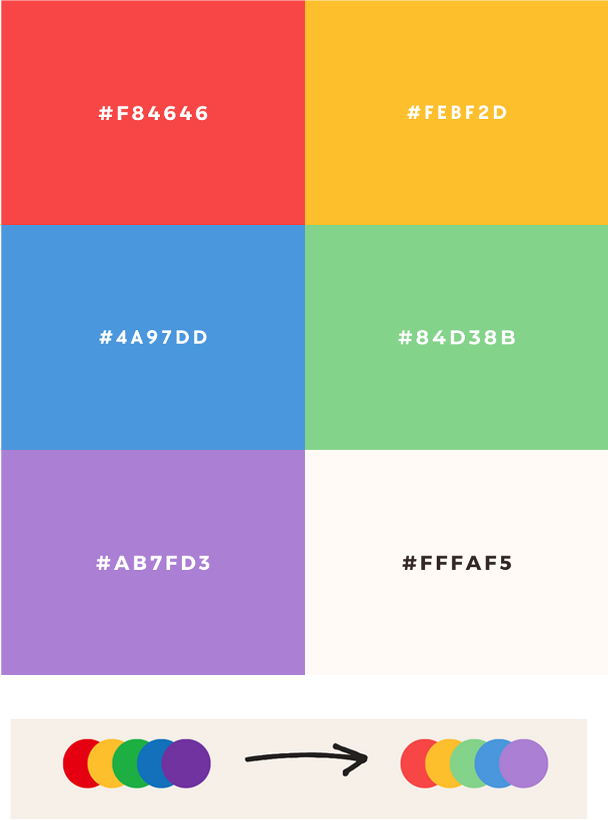
Graphics, Colors Type
I sourced these illustrations & font system set for an easy to use illustration system I took their old primary color palette & chose this one because of the softer colors. The older colors were harsh & dark in saturation & took away from the light playfulness of childhood


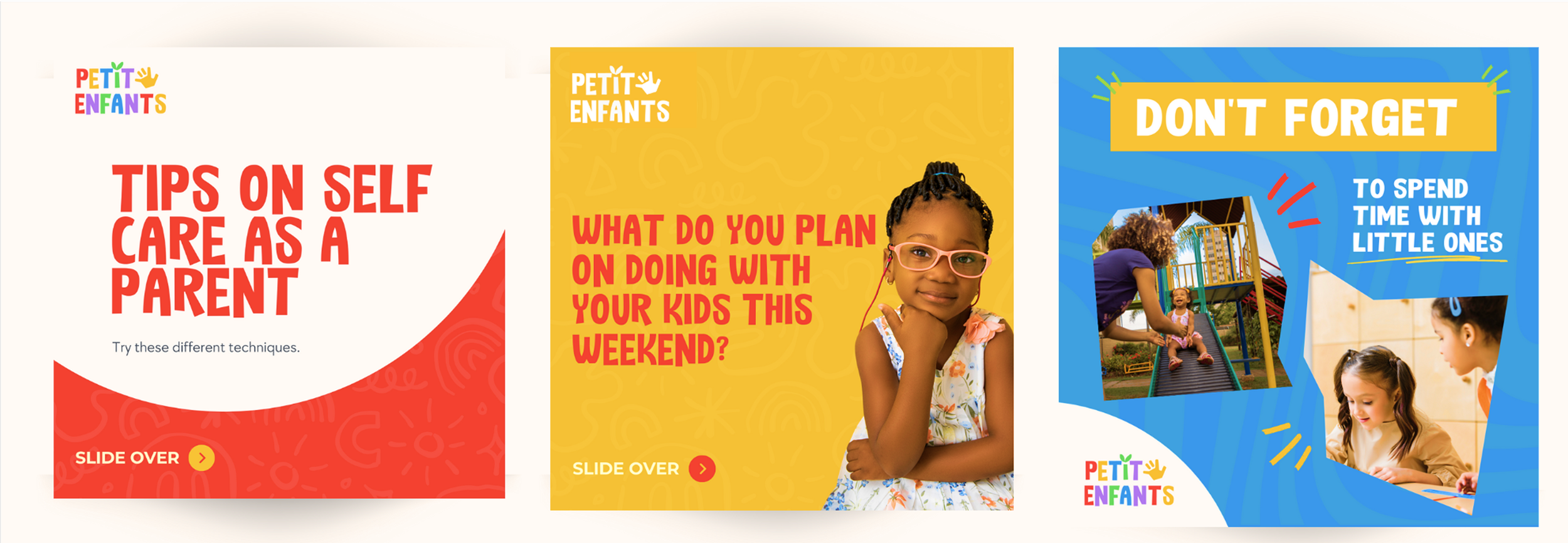
Social Media Revamp
I designed these social graphics so the clients new brand identity could match there existing social media, I also created social media icons & upgraded them to playful colorful icons